
Parenting 101 App & Responsive Site
The Problem: Young adults need a dedicated online destination to learn about being first time parents.
The Goal: Design an app and responsive site that is simple, stylish and inviting for individuals who wish to actively and continuously invest in their parenting skills.


I was tasked with designing a dedicated app and responsive site in service of the public good. On this project, I was the lead UX designer responsible for bringing the Parenting 101 app and website from conception to completed design. I served as the point person for researching, interviewing, wireframing and protoyping.
Who are Our Users?
I conducted preliminary interviews with:
-
5 users
-
all first time parents or soon-to-be first time parents
-
between the ages 18-35
to better understand any differences in need for various age subgroups.
1
Interview Questions
-
What parenting information would you like to see on a parenting app? Why?
-
Describe who you generally get your information from surrounding pregnancy and parenthood?
-
What other services do you think should intersect with parenting information?
-
What are the most disappointing parts of current parenting sites?

Persona
2
I used the data from those interviews to create a persona, a user story and an empahy map to help steer my design direction and problem statement.
.png)
Journey Map

Empathy Map
2
Four major pain points stood out from the interviews:
Most parenting programs are impersonal because they're typically attached to legal services.
1
Users desire a platform that connects with interconnected community services.
2
Many parenting classes are too expensive for financially strapped parents.
3
Parents desire class options for all aspects of childhood.
4
Who's Our Competition?
I performed a competitive audit of both direct and indirect competition in order to get a better picture of the types of app features that work for users and the details that could use improvement.


Wireframes
Using the information I learned from the interviews and the competitive audit, I began initial sketches for the panels for the Trendy Bouquet app.
I chose to focus first on the design of the app because of mobile-first philosophy and because most young users primarily access their information through their mobile phones.

I then created digital wireframes making sure to keep efficiency a priority of my design before moving on to the next round of testing.

Multiple ways to quickly arrive at your destination
Hero description video for users on the go or the visually impaired
Research Study
Methodology
-
Usability Study- unmoderated, remote
-
Participants will search for the 'New Parents' course, buy the course, and then go to the landing page of the course according to their own personal search styles using 5 prompts.
-
Participants are given a questionnaire afterward concerning their experience.
-
Each session is 10-15 minutes
Participants
-
5 Participants
-
2 male, 2 female, 1 non-binary
-
all are first time parents to infants or soon-to-be-parents
-
ages 17-29
-
1 assistive technology users
-
Research Questions
How quickly can the user find the "New Parents" course?
How easy or hard is the app to navigate?
What are the potential places users can get stuck?
Are there any features that would make for a better user experience?
Key Peformance Indicators
Time on Task
System Usability Scale
Conversion Rates
Organizing the Research Results
All participants were recorded (with their written permission) and I took notes based on what I noticed on the recordings. I also took note of any interesting and applicable commentary participants might have shared.
.png)
I then organized the observations into an affinity diagram in order to pin down themes surrounding the participants' user experiences.

Research Results Summary for Two Rounds of Usability Studies
1. It typically took participants around 5 minutes to complete the user journey and 100% of participants completed the user journey.
2. Participants' biggest complaints were about unclear directions and issues with the log in function. These problems were subsequently fixed and the second round of usability testing yielded very promising results and zero participant complaints.
3. Generally speaking, users were able to complete the test with minimal issues and reported excitement about the potential of the app.
Mock Ups & Digital Wireframes for Mobile App
Mock ups of the digital wireframes were created based on the data from the usability test. They were then linked together to form the prototype.
Before Usability Study
.png)
Based on the insights from the usability study, I applied design changes like simplifying the labeling of the ‘sign up’ button in the drop down menu to make for a more streamlined user journey.
After Usability Study
.png)
More Mock Ups
.png)
.png)
.png)

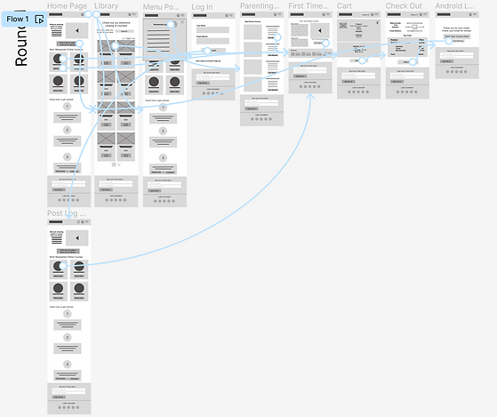
High Fidelity Mobile App Prototype with Connections
.png)
Mock Ups & Prototype of Responsive Website
An accompanying responsive website was created in order to appeal to users who choose to access their information on their laptops.

.png)

High Fidelity Responsive Website Prototype with Connections
.png)
Accessibility Considerations
-
Clear labels for interactive elements that can be read by screen readers.
-
Multiple entry points for user journey depending on preferred path choice.
-
Action buttons are prominent and clearly denoted.
Take Aways & Next Steps
Users shared that the app helped to lessen their anxiety about not only finding a suitable parenting course catered to the general public (rather than for people for which it was court appointed) but also about the potential for it to be used for the long-term for children of multiple age groups.
“This [app] makes it easy to listen to my class on the go.”
~Participant A
Impact
The next steps should include:
-
Building/testing an adequate player function for use in the car.
-
Conduct research on how successful the app is in reaching the goal to be a one-stop shop in helping users become better parents
-
Add more national and local resources for users to aid them in their parenting journey.
-
Flesh out the website to include various age group courses as well as prenatal and relationship courses.